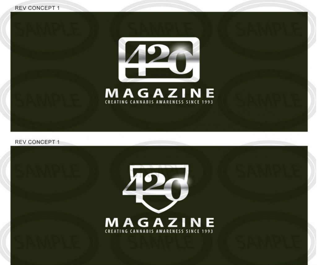
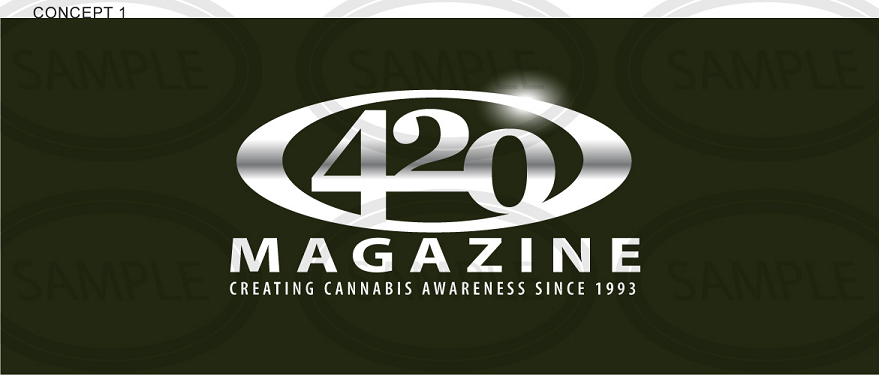
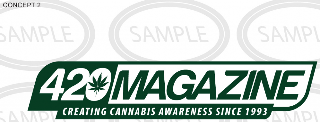
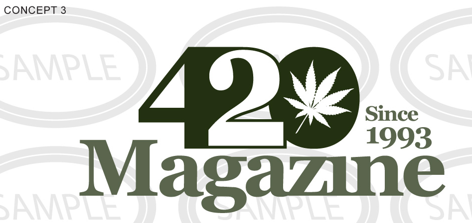
NOW we're talking. There have been a lot of good attempts and great art, but now we're talking. #2 and #4 are my favorite, but they are all excellent. I like how well #2 would translate in B&W, as well as reverse, which is essential to a good logo. It always works no matter how it's used.
Nice work, and +rep from me on what I think is an outstanding effort!
Nice work, and +rep from me on what I think is an outstanding effort!
____________________________________________________________________________
____________________________________________________________________________
____________________________________________________________________________
____________________________________________________________________________
____________________________________________________________________________
____________________________________________________________________________
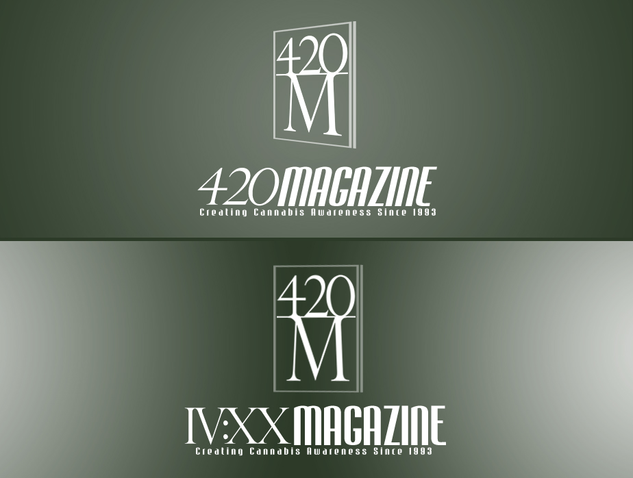
420 I understand you don't have time for detailed criticism. However is it possible for you to tell us which one you like the most, even if it may not be "the one"? And if none say none?


")
")