- Thread starter
- #41
420
Founder
Getting closer. 

How To Use Progressive Web App aka PWA On 420 Magazine Forum
Note: This feature may not be available in some browsers.
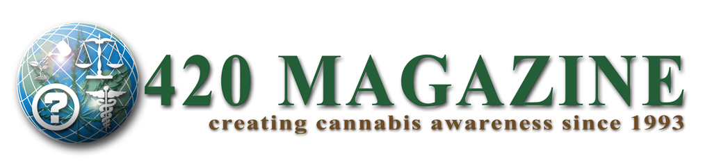
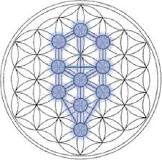
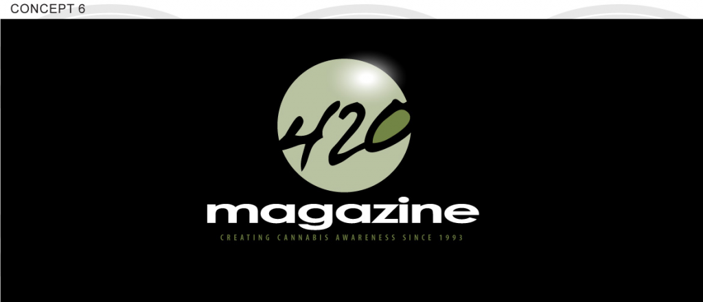
i really like the blue globel one nice job.

")
I might have missed it, but don't see the information. Since you're wanting something that can be used for a print magazine... What physical size would be best? And what resolution? Magazines use offset printing and typically, what, 300dpi? I think dye sublimation printers also use that resolution, so if you're using them (to print t-shirts or other fabric, for example)... But you'd be printing images larger on t-shirts than on a magazine cover/title page or even, say, a baseball cap. Hmm...
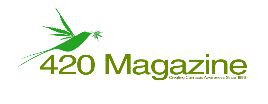
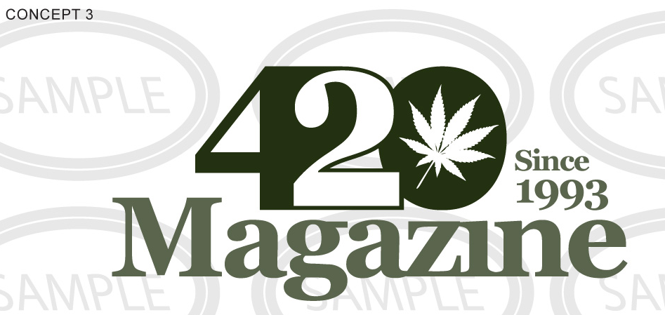
Ought to be able to find a symbol other than a cannabis leaf. Nothing against it as such, but it has negative feelings for many. Every time I read a report of someone getting busted for "that evil weed" (lol) the television station or newspaper has placed cannabis leaves prominently at both sides of the top of the article. Show something with cannabis leaves on it to many non-consumers and they turn thier noses up while they shut their eyes and their minds.
What about something that hints at the medicinal, industrial, food and nutritional aspects?
Of course if you just want to get noticed in a positive way by those of us who already understand, a cannabis leaf is fine. After all, it's what we've come to expect as a symbol from cannabis information sites, seedbanks, dispensary sites, NORML sites, et cetera.
The above is only my opinion of course. I almost didn't post it, but after spending the five minutes to attempt to state it tactfully, I figured that I would go ahead and spend the two minutes to type it, lol.

")
__________________________________________________________
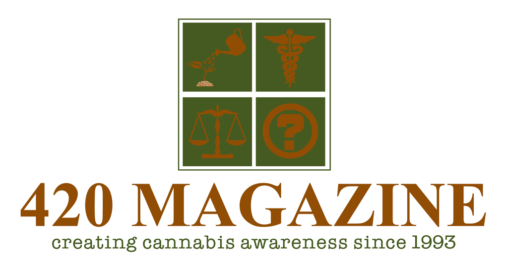
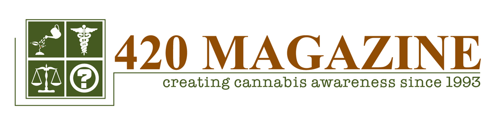
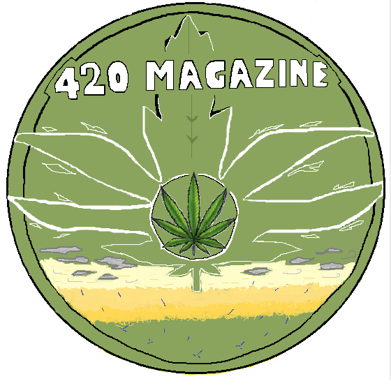
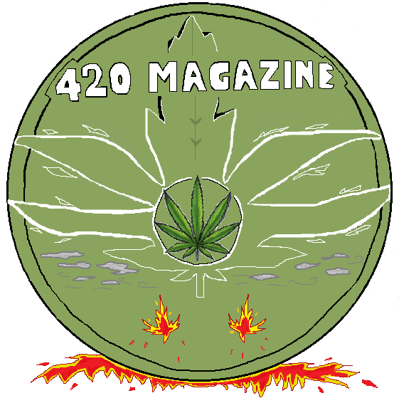
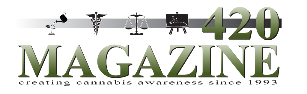
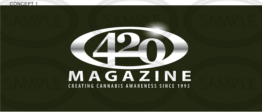
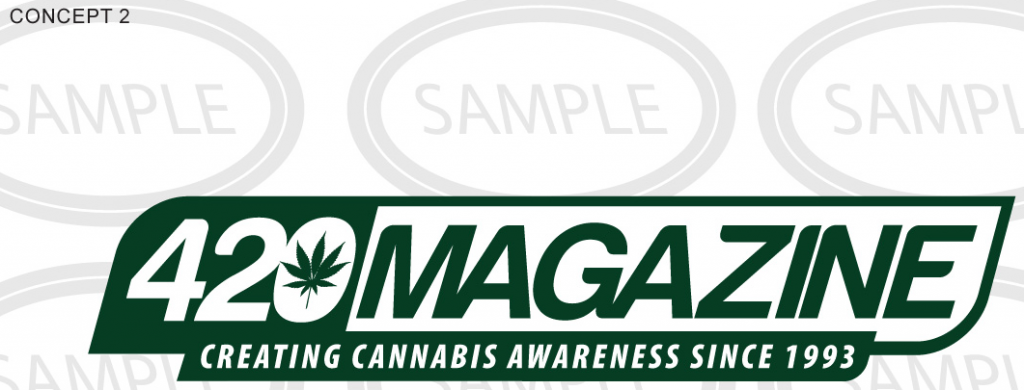
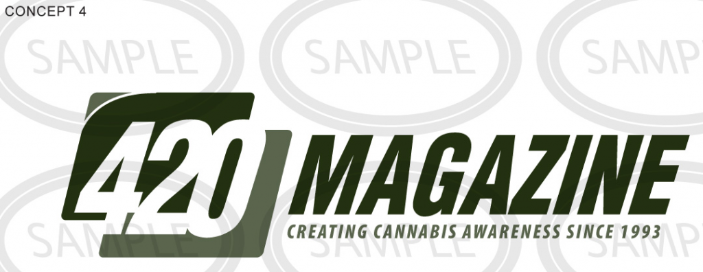
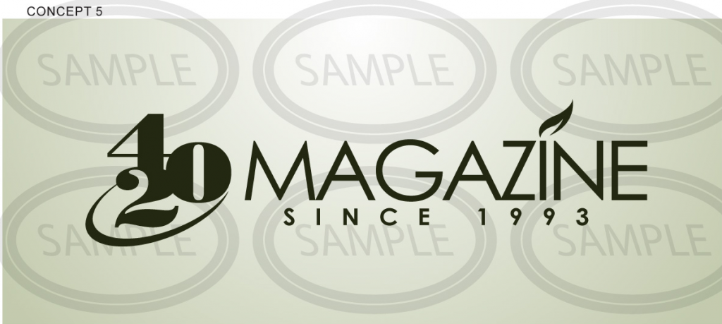
Those look nice. The font that you used in 420 Magazine is clear and easy for the eyes to deal with; it isn't plain or overly busy (I like serif fonts) even though it is shadowed and has a bit of fade (can't remember the correct word). I also like the second one best. The slogan in all lower-case works well with the overall design. Have you played around with moving the 420 to the left (or possibly centered with your various icons surrounding it)? That would be one way to make the whole thing slightly less wide and remove the blank space without it looking like you realized that you had one and then added something to fill it in as an afterthought. I can see the first icon as both a food crop and "industrial" growing, but have you any icons that are more specific to each? Have you got one with a brownish tan (not bold; almost - but not quite - faded? Something that's complementary but stays mostly in the background, so to speak?) color somewhere in the background? Maybe a mild yellow-orange, something like what you get once in a while when the sun has almost gone over the horizon (or just risen from) at the water's edge, only with less red component? Does it annoy you that I'm playing 20 questions with your creation (lol)? Possibly even incorporating such a setting into the background of the design - again, faded so as not to overpower that green motif that you used for the font, the only purpose would be to hit those mental/emotional buttons that admen like to aim for without actually adding to (or taking from) the message contained in the rest? Or just somehow working the color scheme in? One of the countless themes in my current linux OS uses something like them and it hits the relaxation and comfort buttons without depressing the thought processes in any way.
I wasn't so keen on the fade-in underneath the top of the first design. It just doesn't work for me for that particular setup. Uhh... Almost seems - to me, and I'm no graphic arts professional or art critic - that it serves no purpose. Hope that doesn't cause anger, just mentioning how it hits me. But everyone knows that I often walk in a different reality than everyone else so it could be that I'm the only one that is affected in that way by it.
EVERYONE'S entries are better than I could come up with. Thanks for submitting them. And thanks to 420 for making this a public thing so that we can see them all.
____________________________________________________________________________
____________________________________________________________________________
____________________________________________________________________________
____________________________________________________________________________
____________________________________________________________________________
____________________________________________________________________________
420 I understand you don't have time for detailed criticism. However is it possible for you to tell us which one you like the most, even if it may not be "the one"? And if none say none?