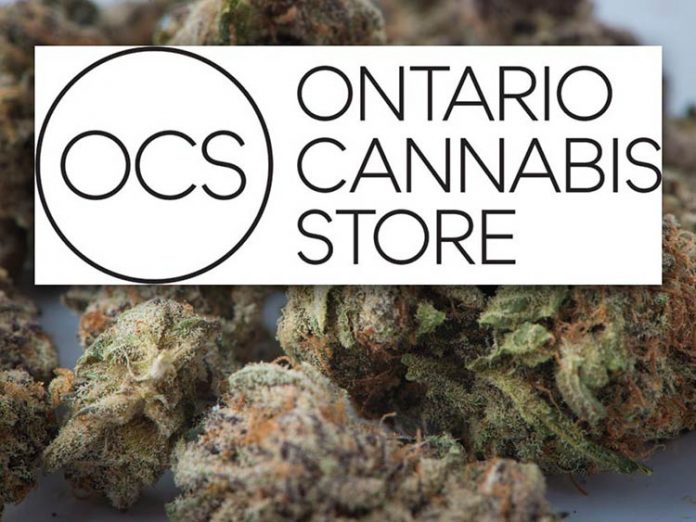
The smoke has cleared surrounding the name and logo of Ontario’s new pot retail regime. Welcome to the Ontario Cannabis Store.
But, like a stoner with the munchies, the new look has many observers craving something else.
In a press release Friday, the Liquor Control Board of Ontario (LCBO) showed off two versions of the thin font black-and-white branding featuring a circle with the abbreviation OCS inside alongside the full “Ontario Cannabis Store” text.
The new name and logo will be used for both brick-and-mortar locations as well as the online store.
The simplistic and clean approach was an intentional choice to project a specific image to Ontarians.
“The name is designed to convey a safe, simple and approachable environment for consumers, and agency employees, in a clear and easily understood manner,” said the announcement. “We are confident the brand name and logo will help ensure Ontarians are able to safely and easily identify Ontario Cannabis Stores as the sole legal retailer of non-medical cannabis in Ontario.”
Both in-store and online options will be powered by the Ottawa-area headquartered Shopify. In addition to cloud-based technology, they will provide in-store displays for product and health information along with an iPad-based point of sale system.
The agency also revealed the Ontario Cannabis Retail Corporation Board of Directors. The list includes individuals with backgrounds in mental health as well as current LCBO board members.
But with speculation over, “Ontario Cannabis Store” almost immediately began trending on Twitter with users mocking the ‘high’-class design like a pot-induced laughing fit.
One user tweeted, “pleased to debut my proposal for the new ontario cannabis store logo,” with a screenshot of a blank Microsoft PowerPoint title with “Ontario Cannabis Store” simply typed in.
“Feel like they are missing this on the Ontario Cannabis Store logo,” another user tweeted alongside a picture of a 2013 Foodland Ontario calendar with their well-known marketing phrase “good things grow in Ontario.”
“The Ontario Cannabis Store seems to have taken a branding lesson from the one and only No Name,” reads another comment.
Meanwhile, some users pointed out that “The Ontario Cannabis Store” can be abbreviated to TOCS — or tokes — which may prove more popular and doesn’t seem to fit with the LCBO’s branding goals.
So how much did it cost?
According to an LCBO statement, the agency has estimated the cost of the overall brand strategy at approximately $650,000. They note that price tag includes the brand name and logo but also other aspects of brand development.
An official launch date has not been determined, but it appears the final legislation will not be passed by the Senate in time to meet the initial Liberal deadline for marijuana legalization on July 1, 2018.
LCBO statement
The development of the brand name and logo was guided by the government priorities of restricting access to youth, protecting public health and addressing the illegal market. The name conveys a safe, simple, open and approachable environment for consumers in a clear and easily understood manner.
The name and logo are only one piece of the overall work from Leo Burnett, which included the development of the overall brand strategy, brand guidelines and, eventually, the development of the logo and brand name.
Overall, LCBO expects the total cost of all brand and marketing from Leo Burnett to be approximately $650,000.
The process of this branding work and development is aligned to regular practice: market research, developing a set of values and purpose, overarching strategies, tone, developing a suite of brand assets including a logo, and brand guidelines for marketing and future use of the brand properties.
We are in the unique position of having to establish a new brand to serve a completely new regulatory environment where many of the proposed marketing provisions and regulations are not yet federal law. To build a broad, province-wide brand that will be recognized as a sole retailer of legal recreational cannabis required thoughtful and strategic brand development strategies, and consultation from a variety of stakeholders.
For context, the LCBO conducted a brand refresh that was rolled out in May 2014 at a value of $500,000. The branding work included advanced research, a new logo, typeface, crest, colour palette, brand guidelines, and a new brand vision of “Let’s Get Together.”


